This week, I learned about typography by reading an article called “When Typography Speaks Louder Than Words.” Typography, which can be defined as “the style and appearance of printed matter,” is the visual aspect of an image; the verbal aspect, on the other hand, is the literal meaning of the words in the image. The size of the text, the font, the color scheme, and the placement of the text all contribute to the visual aspect. Graphic designers can make the visual and verbal aspects coincide to create a cohesive image, or they may decide to make them diverge to prove a specific point. There are many great examples of typography in the article, such as the picture below:
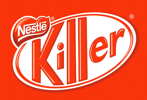
We recognize the visual as the Kit Kat logo, but the verbal message is completely different. I tried to find a few images in which the visual and verbal meanings seemed to be in alignment.
For example, the text in the picture below says, “Wake Her Up with Coffee,” so that is the verbal message. The font dances across the page, making the appearance very lighthearted and fun. The font for the word her is bolder than the fonts for the rest of the words, which separates it from the surrounding text and emphasizes it. The color scheme is light and bright, providing a sense of warmth. Additionally, the picture of the coffee cup complements the verbal message, and the hearts convey a feeling of love. The visual aspect is very cheerful and affectionate, and it seems to match the verbal aspect since we make coffee for the people we care about.

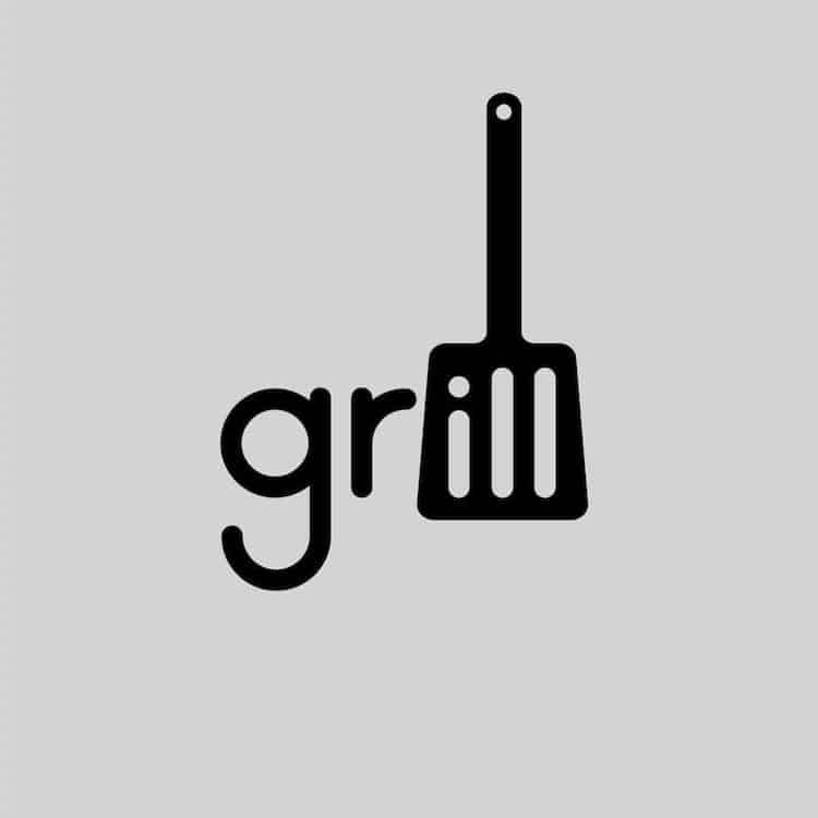
The picture below offers another interesting example. The verbal aspect is the word grill, and the visual aspect incorporates a picture of a spatula, which is an appropriate choice since it is a tool used for grilling. The visual and verbal messages coincide:
The last example is my favorite. Below, you will find various words that describe a cat, and they are arranged in the shape of a cat. The words that describe the cat are the verbal messages, while the arrangement of the words to make it look like a cat is the visual message. The words reinforce the image of the cat:
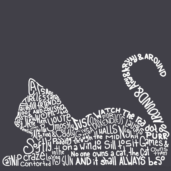
The authors say that “typographic treatment works alongside verbal language to create, alter, or enhance meaning,” and it can also “manipulate feelings and reactions.” There is no question that typography can be very powerful when delivering a message and can affect us even more than the literal words can. The visuals make us take an initial interest in the image; my eyes were drawn to the picture of the cat before I knew what the words said. Graphic designers deserve a lot of credit for all the thought and effort they put into their creations. Click the link below to check out the article if you want a more in-depth explanation of typography! https://www.smashingmagazine.com/2012/04/when-typography-speaks-louder-than-words/
